

People live in their phones and we don’t need any big studies to show this. Look around, if you’re in a public place my guess is that you see at least one person face-planting in their phone.
Having a mobile friendly website can be very important to your online success. This can be achieved by using a platform that is already mobile friendly or by creating your own responsive and mobile optimized website. Responsive sites react to a device’s screen size and display their content appropriately which greatly improves usability. Mobile optimized sites make changes to correct device compatibility issues, shorten load times, minimize data usage and add features. Many great mobile designs use a combination of these two techniques to create mobile websites that are fast and easy to use.
Design websites on a large screen but always keep mobile in mind.
If you don’t have a mobile friendly website here are some good reasons that you should consider making the switch:
Increase in Mobile Traffic
As more mobile devices hit the market each day it becomes increasingly important for your website to be mobile friendly. Analysis on the websites I manage shows a constant rise in views coming from devices with small screen sizes. If your website doesn’t work on mobile devices you may have just wiped out a significant portion of your viewers.

Search Engine Ranking
Being mobile friendly also plays a part in your website’s search engine ranking. Search providers want to display quality results and being mobile friendly shows that your website is up to date and will render correctly for all of their viewers who click on it. Having a mobile friendly site can also help you be found by potential customers who are just passing through as they will most likely be using a mobile device when searching for your services.
Google provides a free tool that can be used to test your website’s mobile friendliness: https://www.google.com/webmasters/tools/mobile-friendly/
Usability
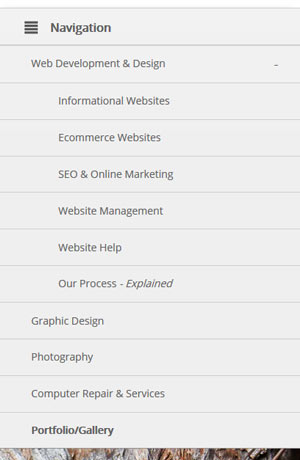
Mobile users don’t interact with a website in the same way that desktop users do. They will click and scroll with their fingers rather than with a mouse, which in most cases will require some accommodations. Clickable elements may need to be rearranged for easier access. You may also want to enable a mobile menu or back-to-top feature for easier navigation on smaller devices.
If your website doesn’t work as users expect it to they normally won’t stick around very long. Higher bounce rates on a specific device or screen size may indicate a mobile usability issue.
Social Media
If you are using social media as a means of advertising it would be a good idea to have a mobile friendly website. Many people use social media apps on their mobile devices and will look at your website on the same device when they click on your ad.